Carbondale
Rodeo
Carbondale, CO
Rebrand // strategy // APPAREL DESIGN
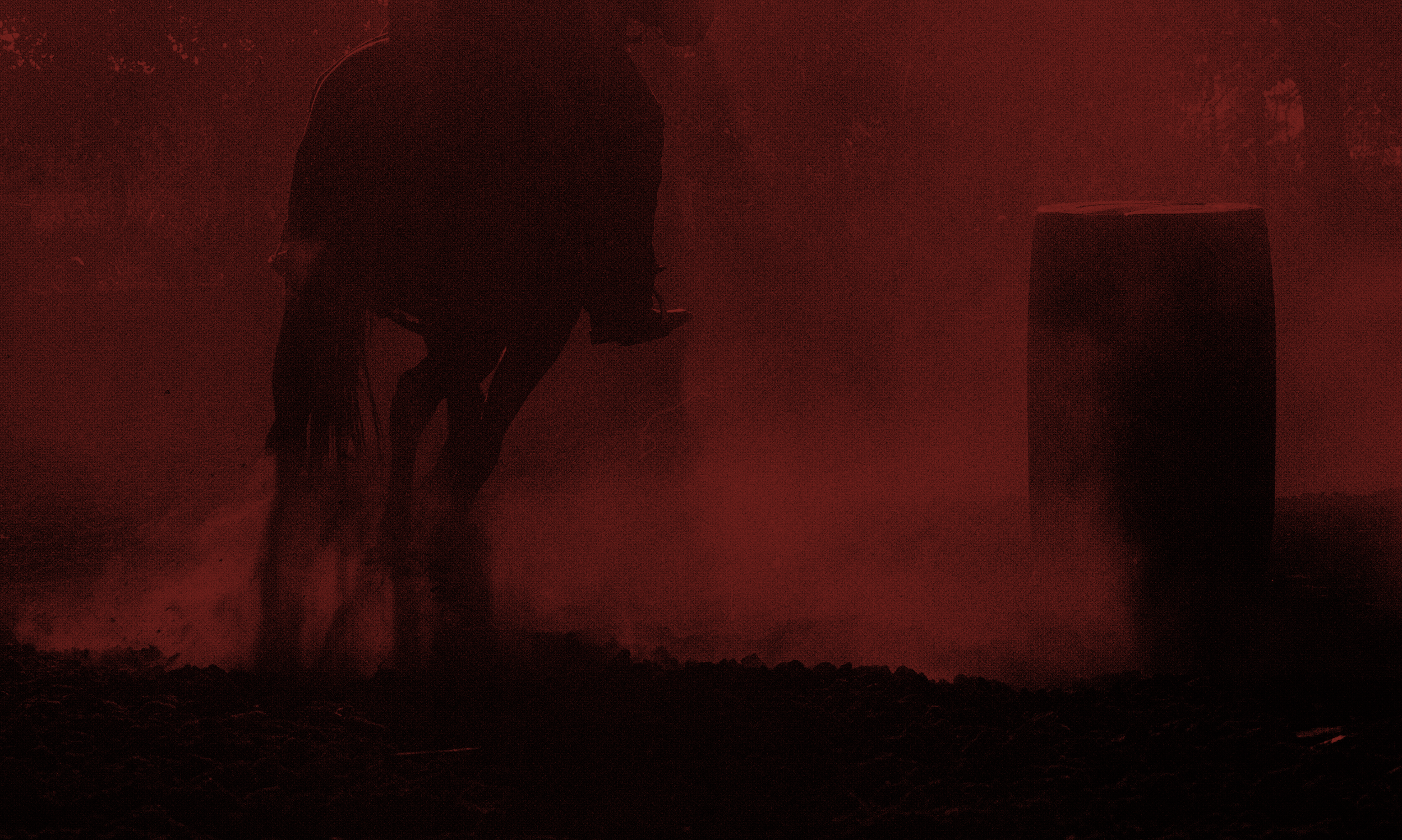
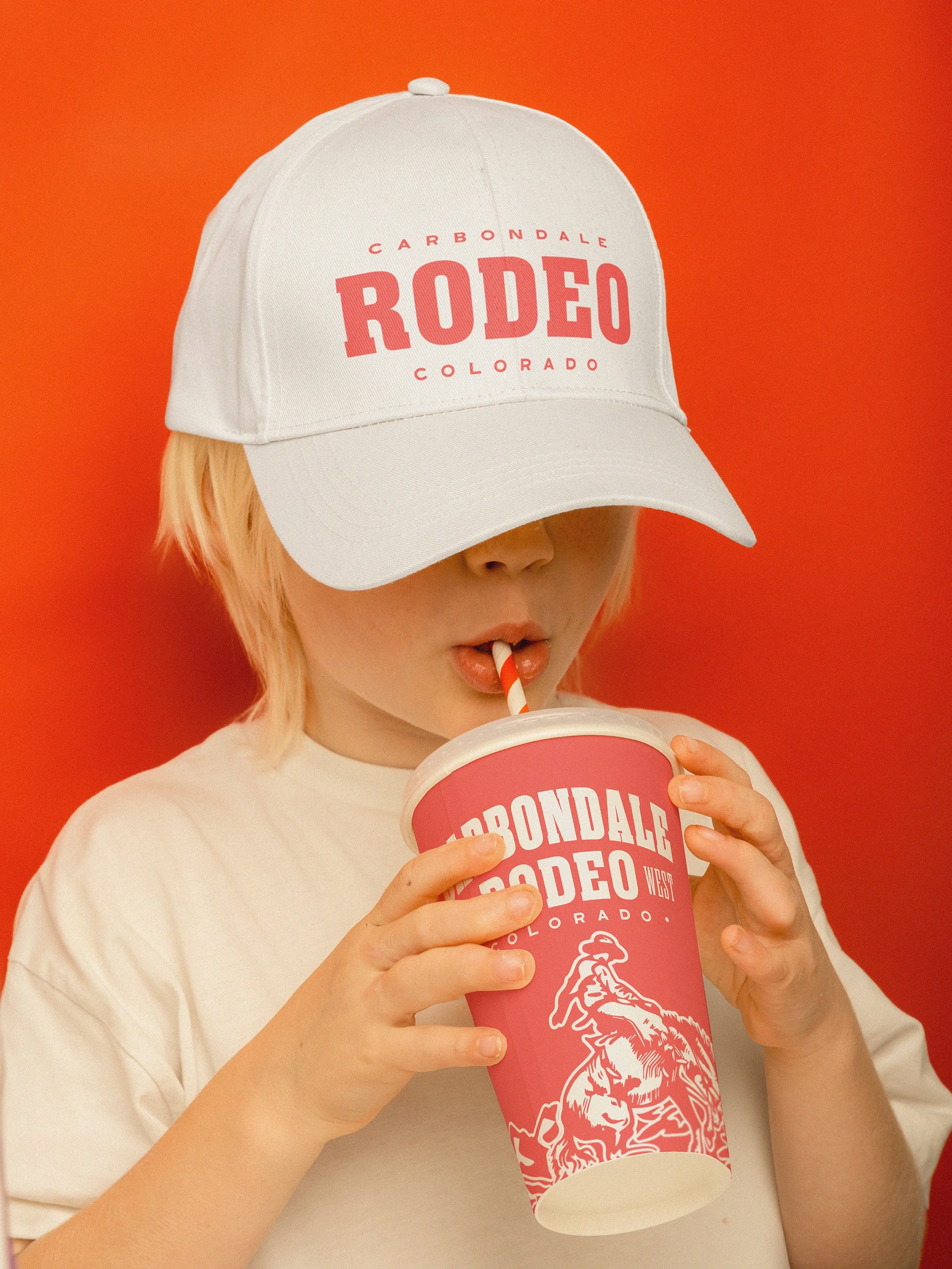
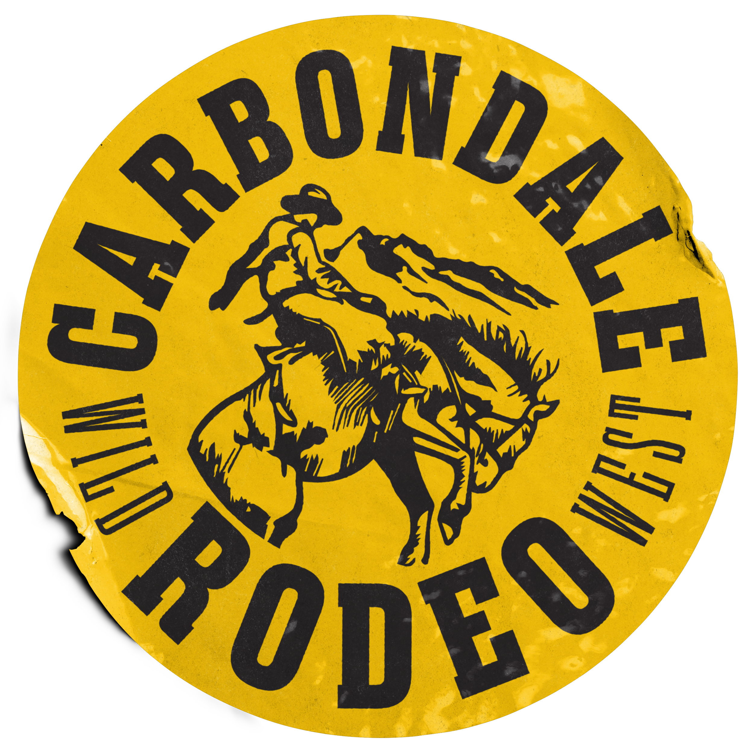
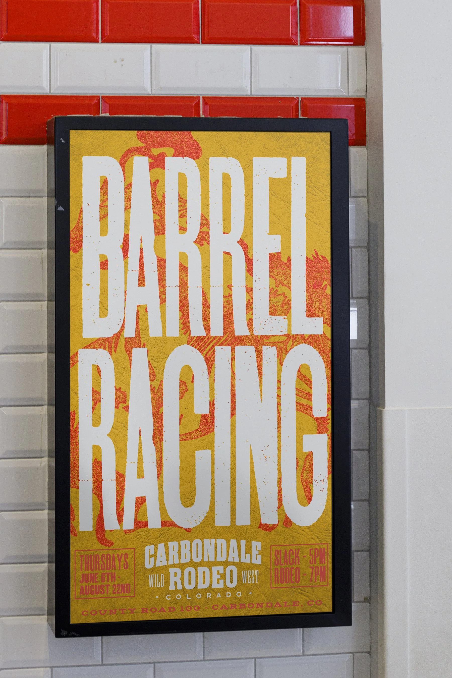
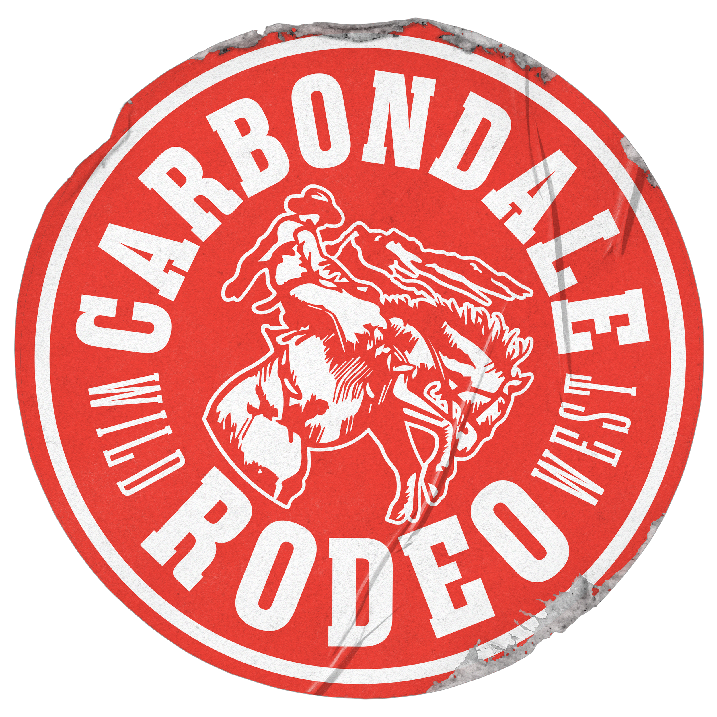
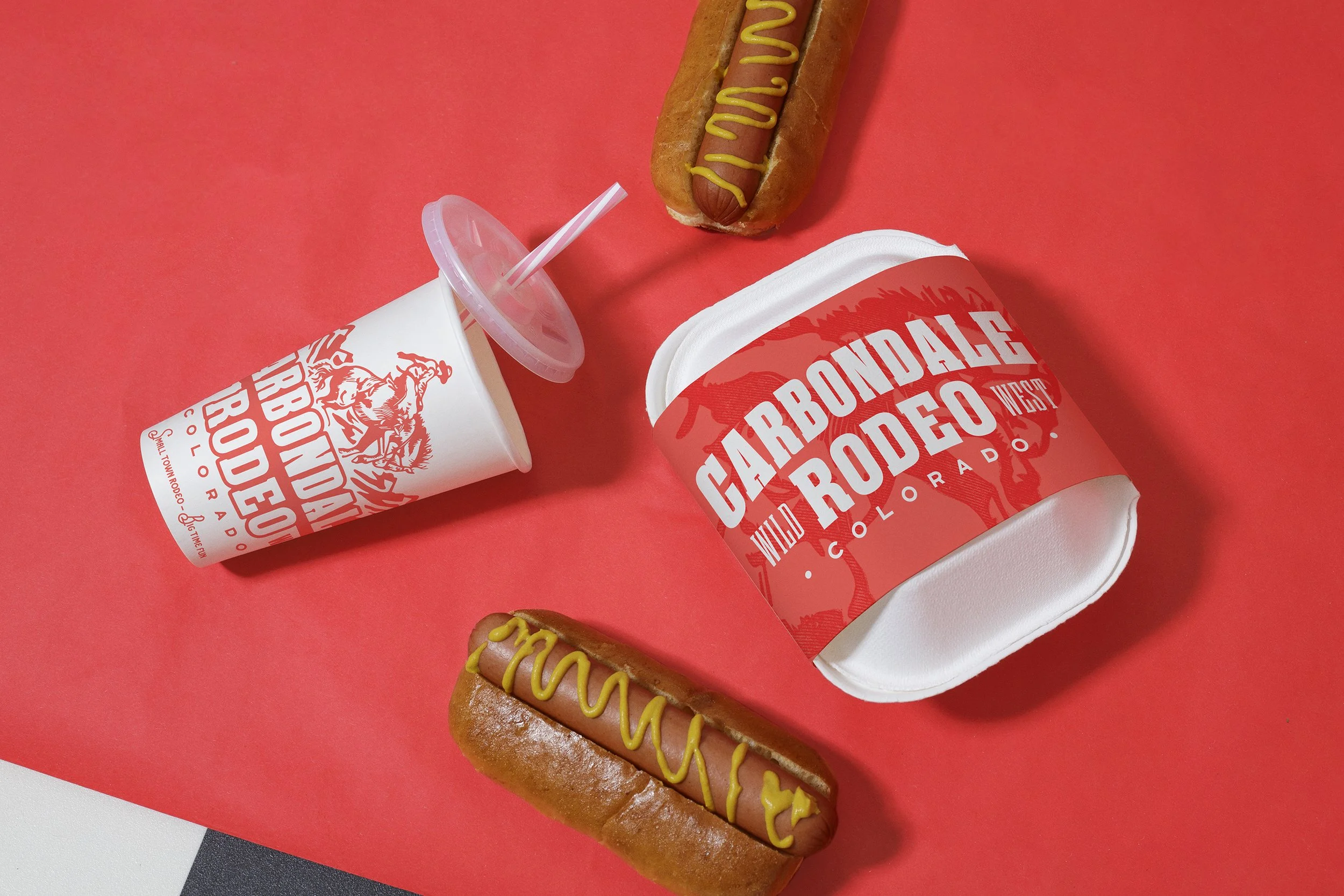
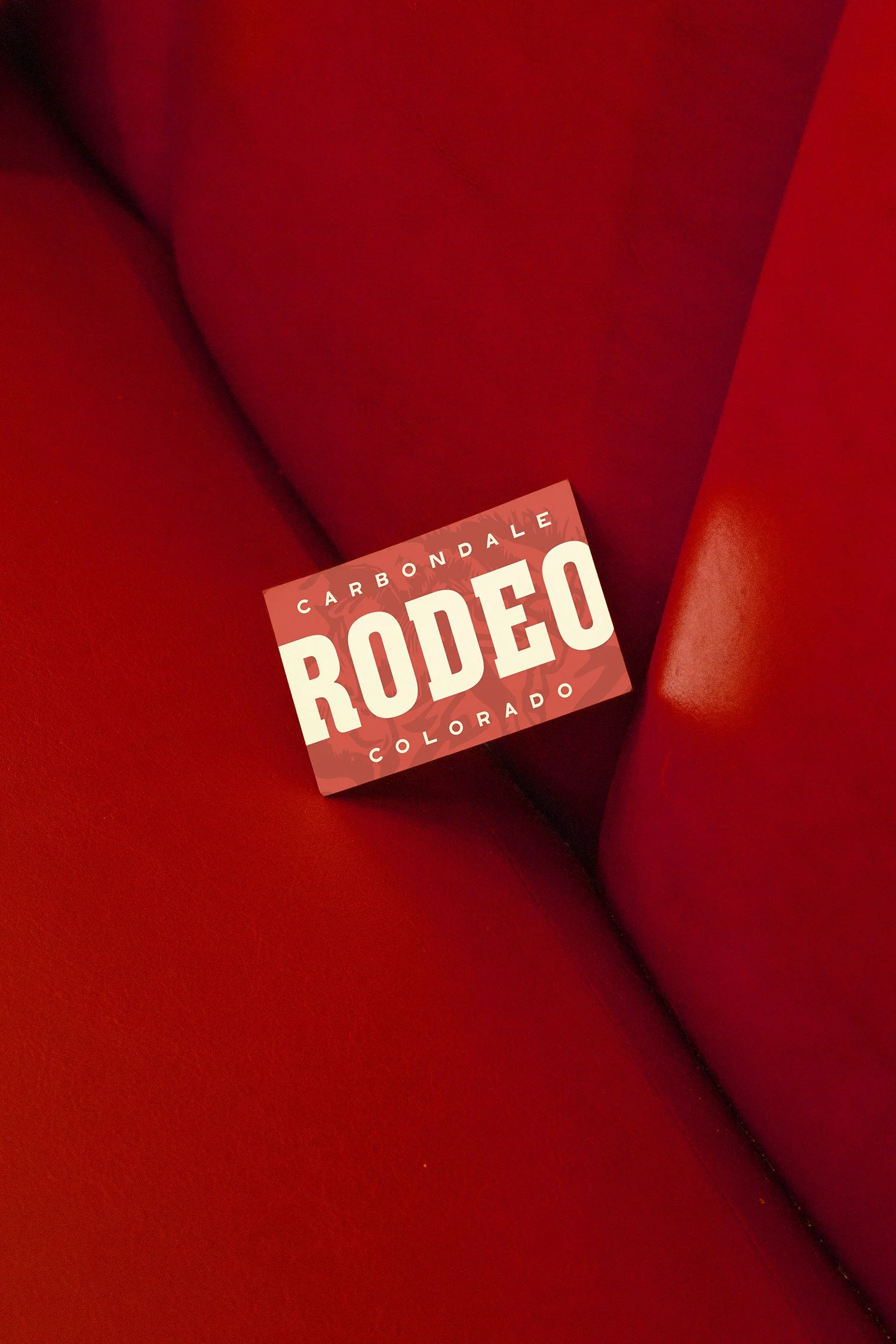
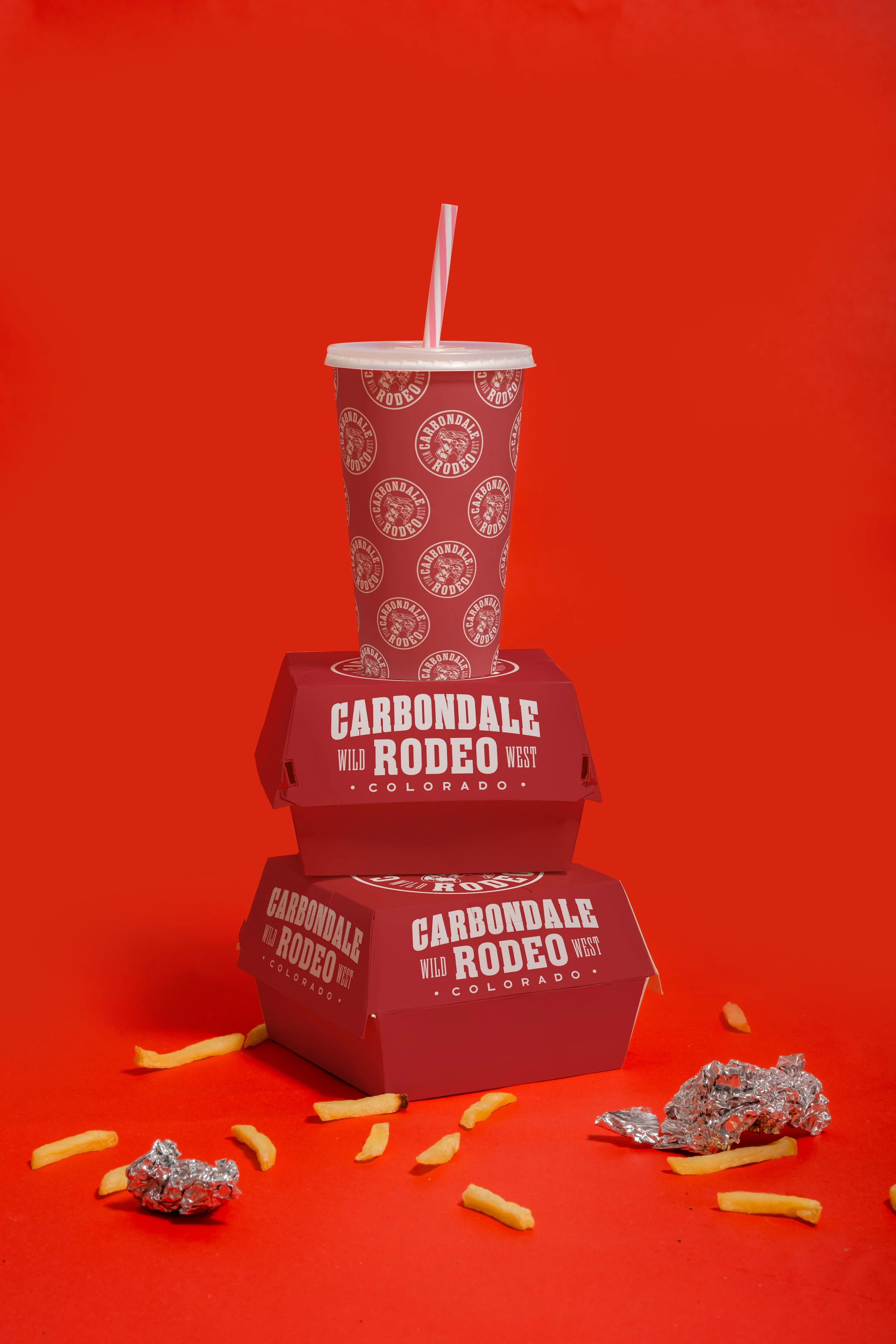
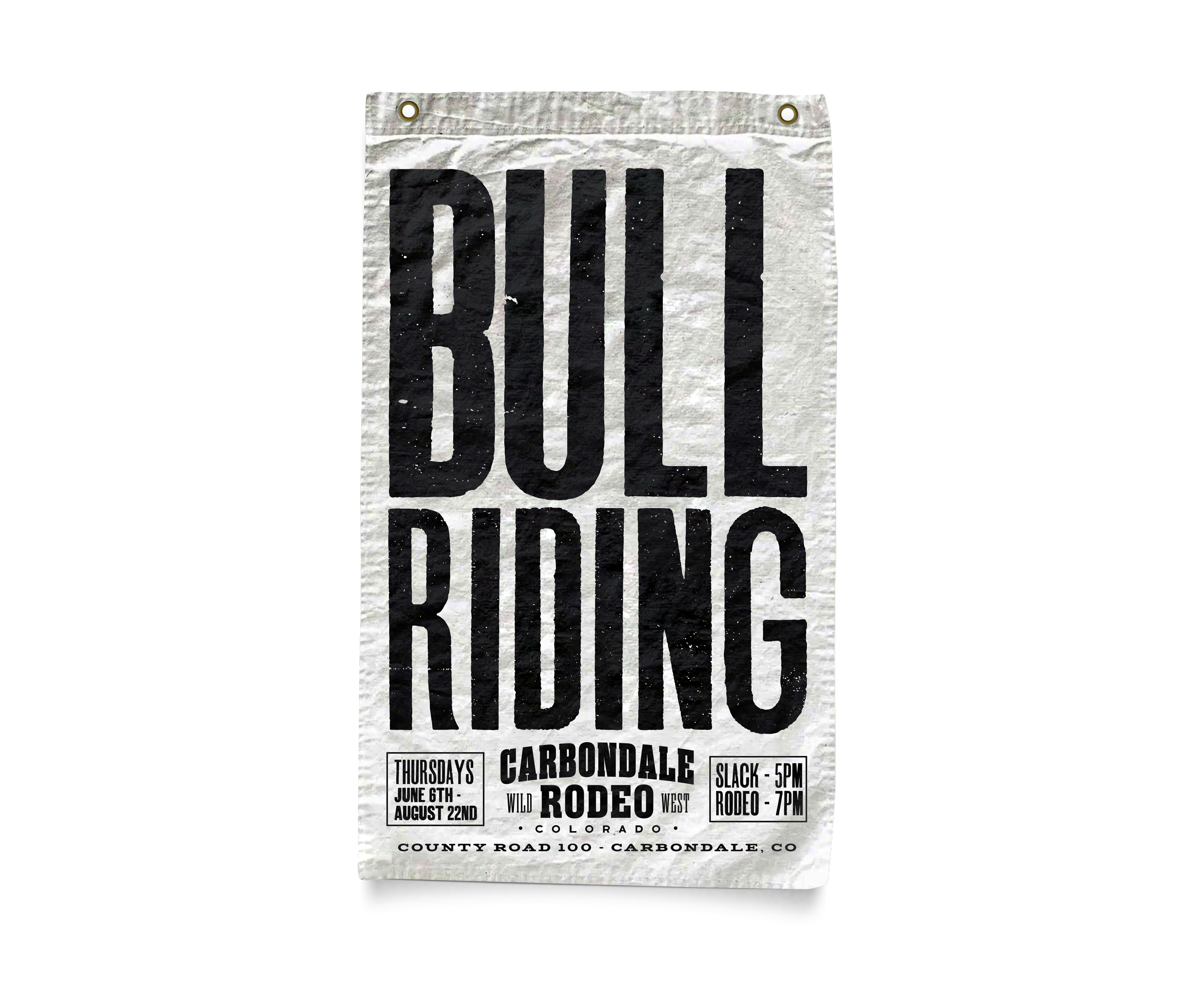
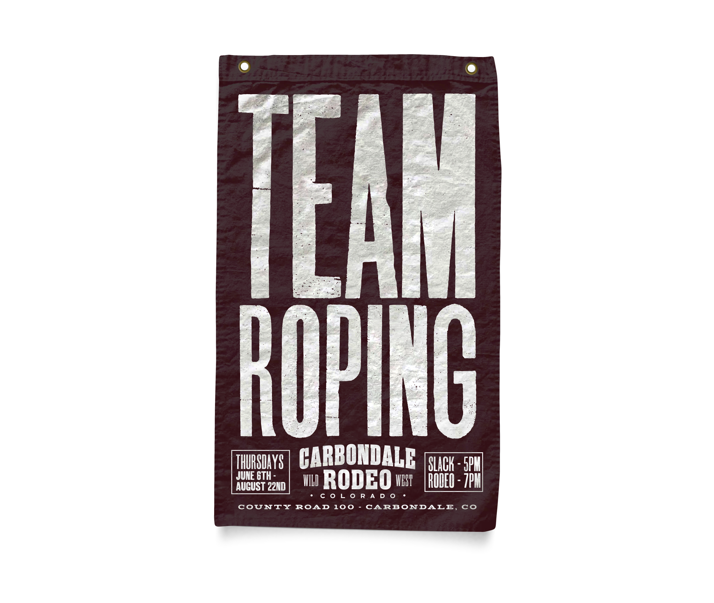
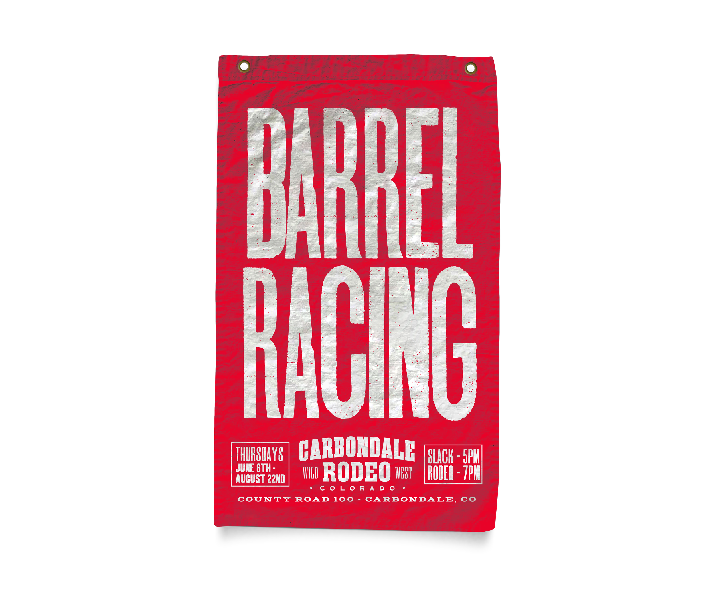
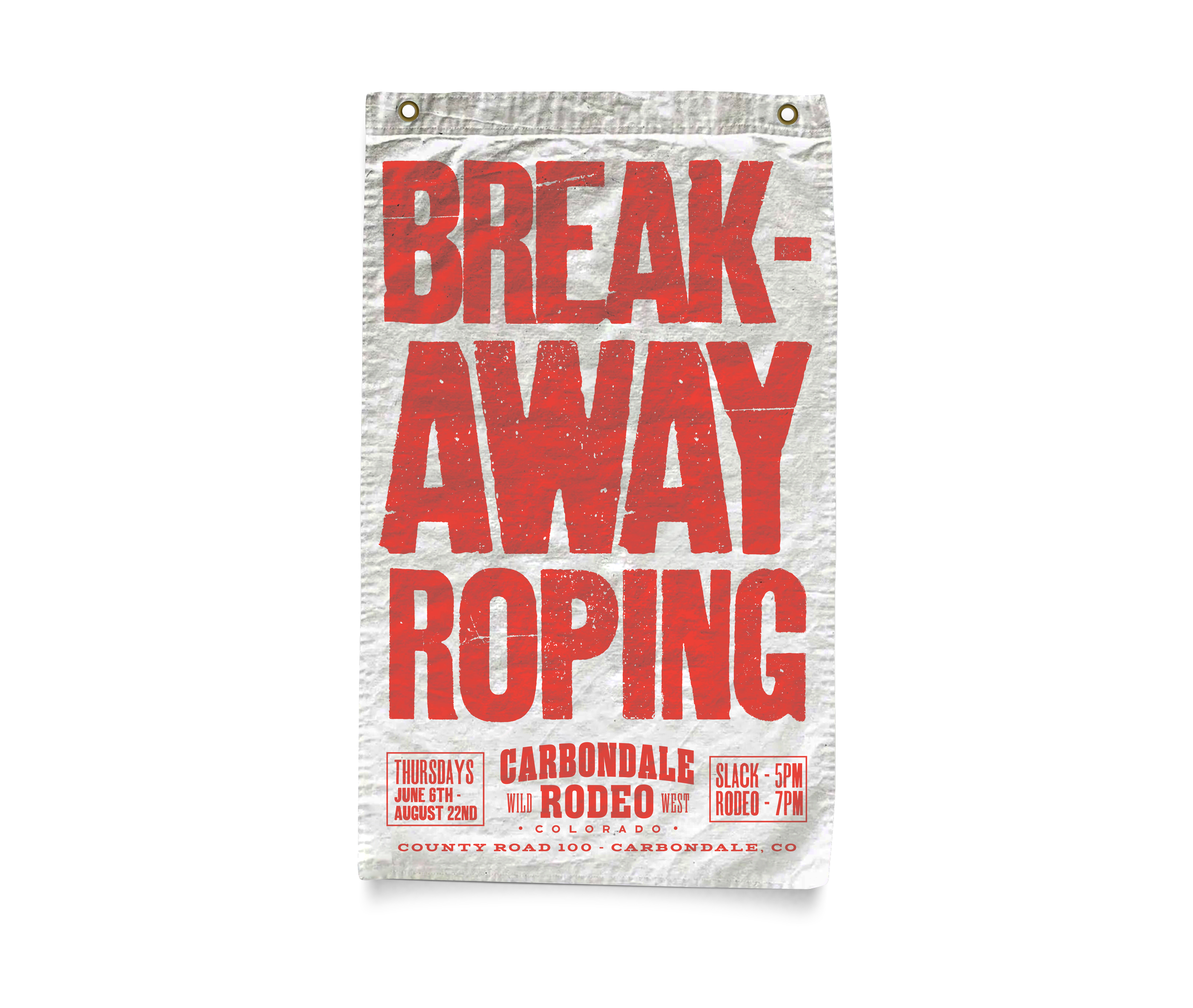
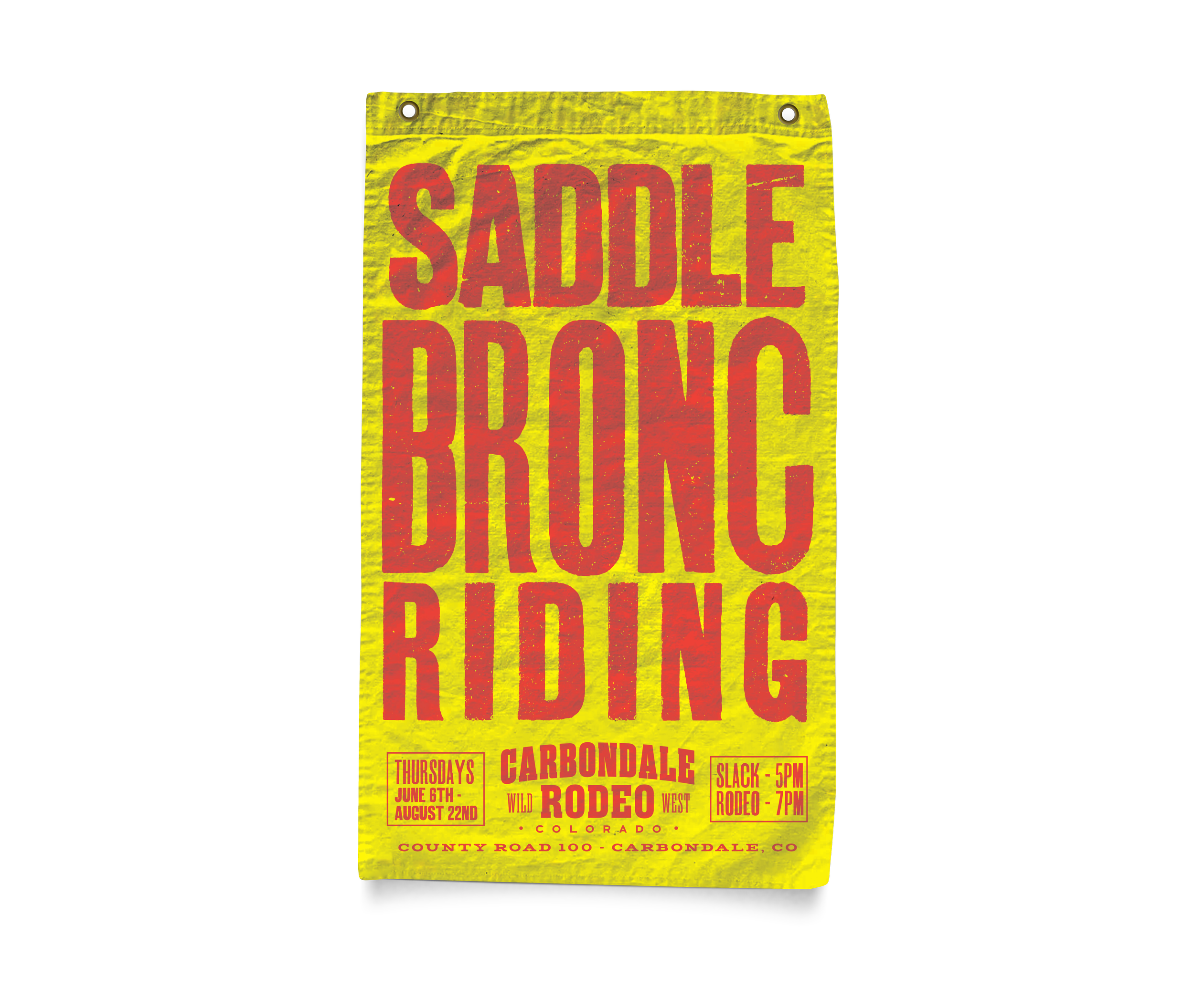
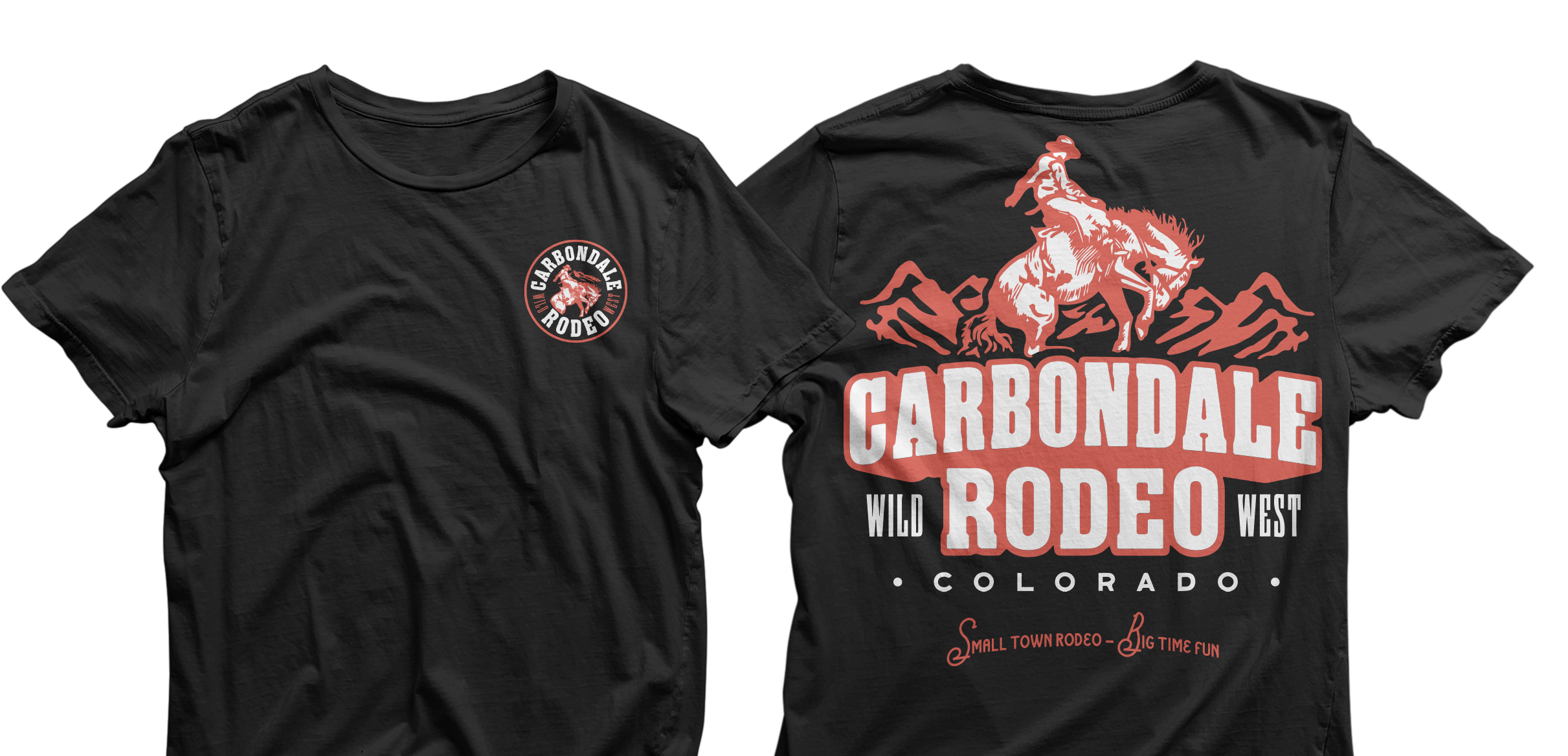
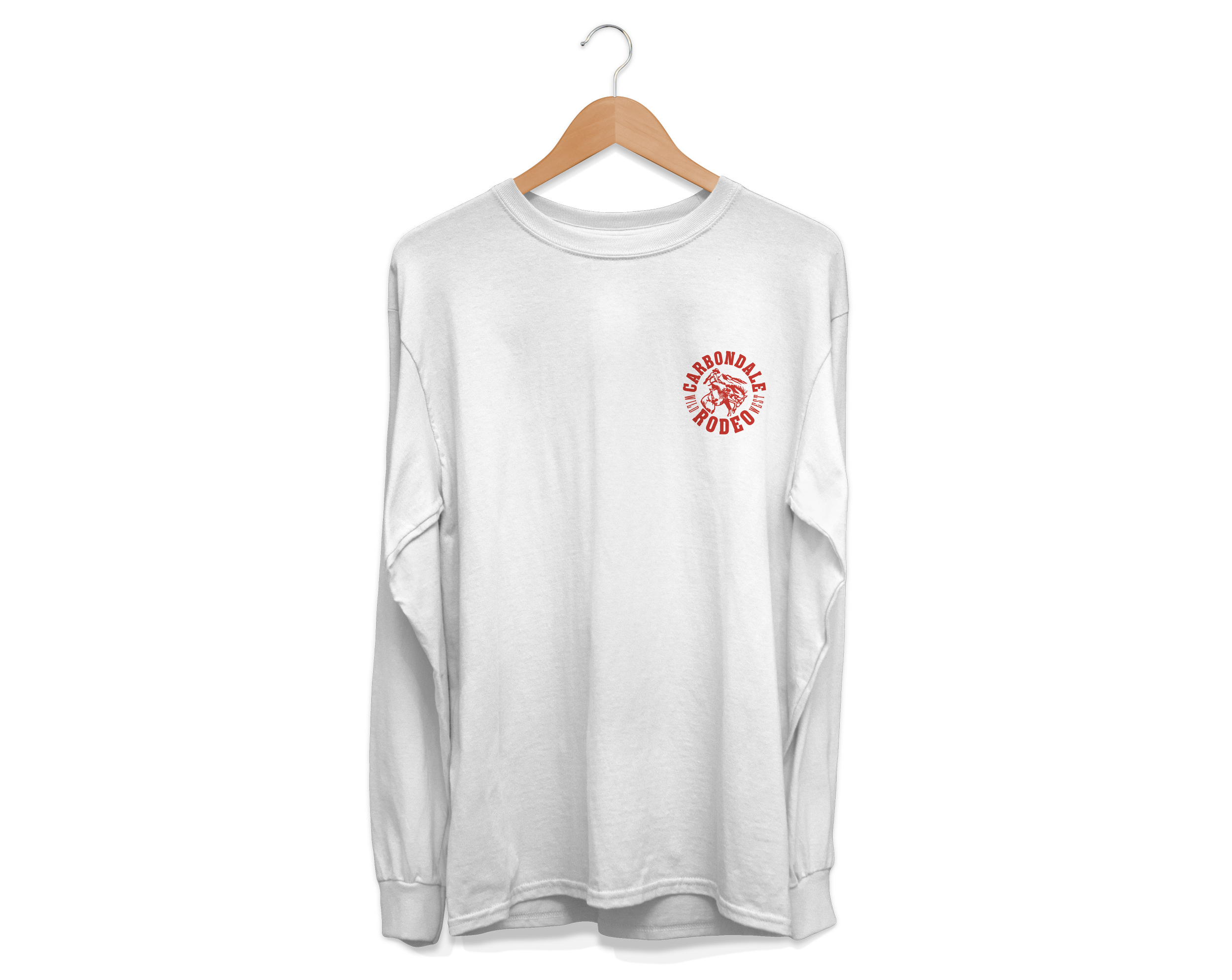
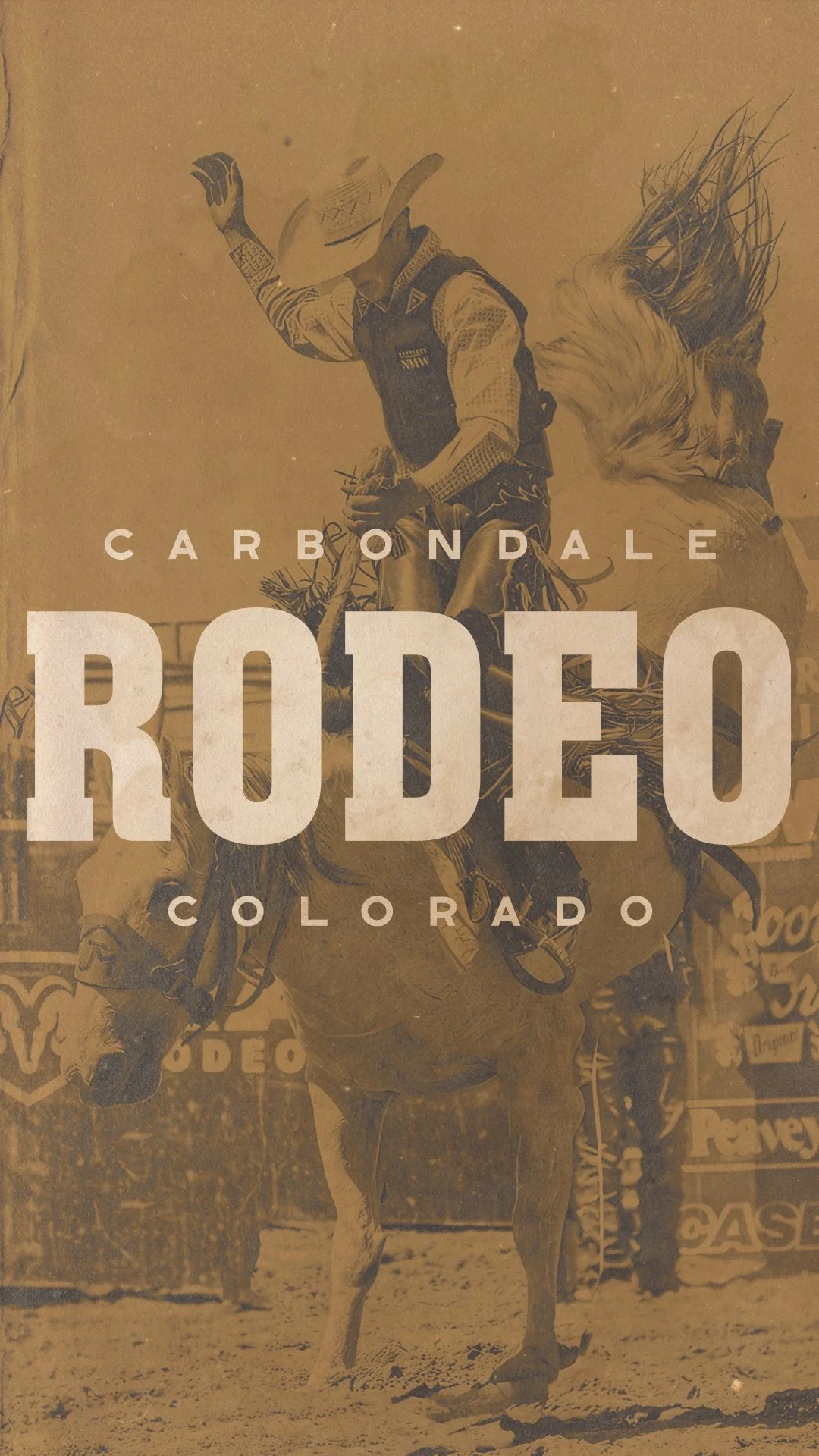
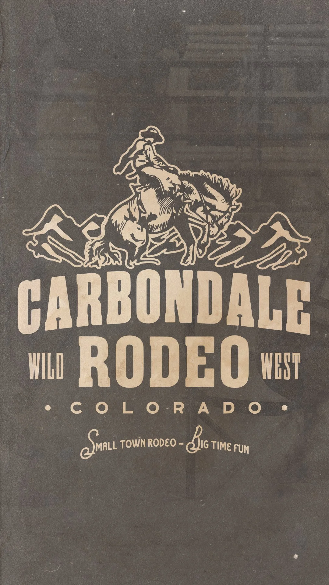
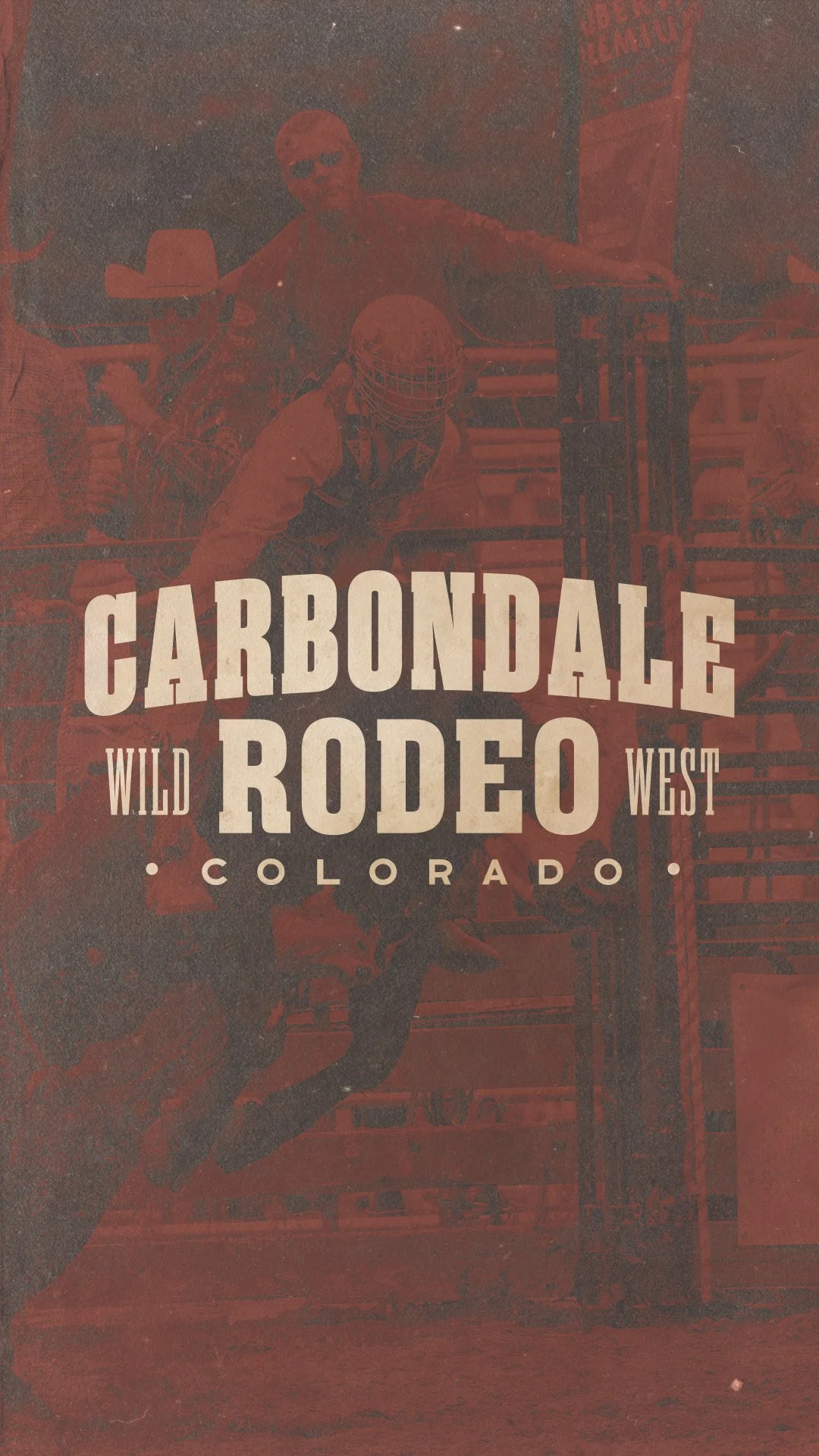
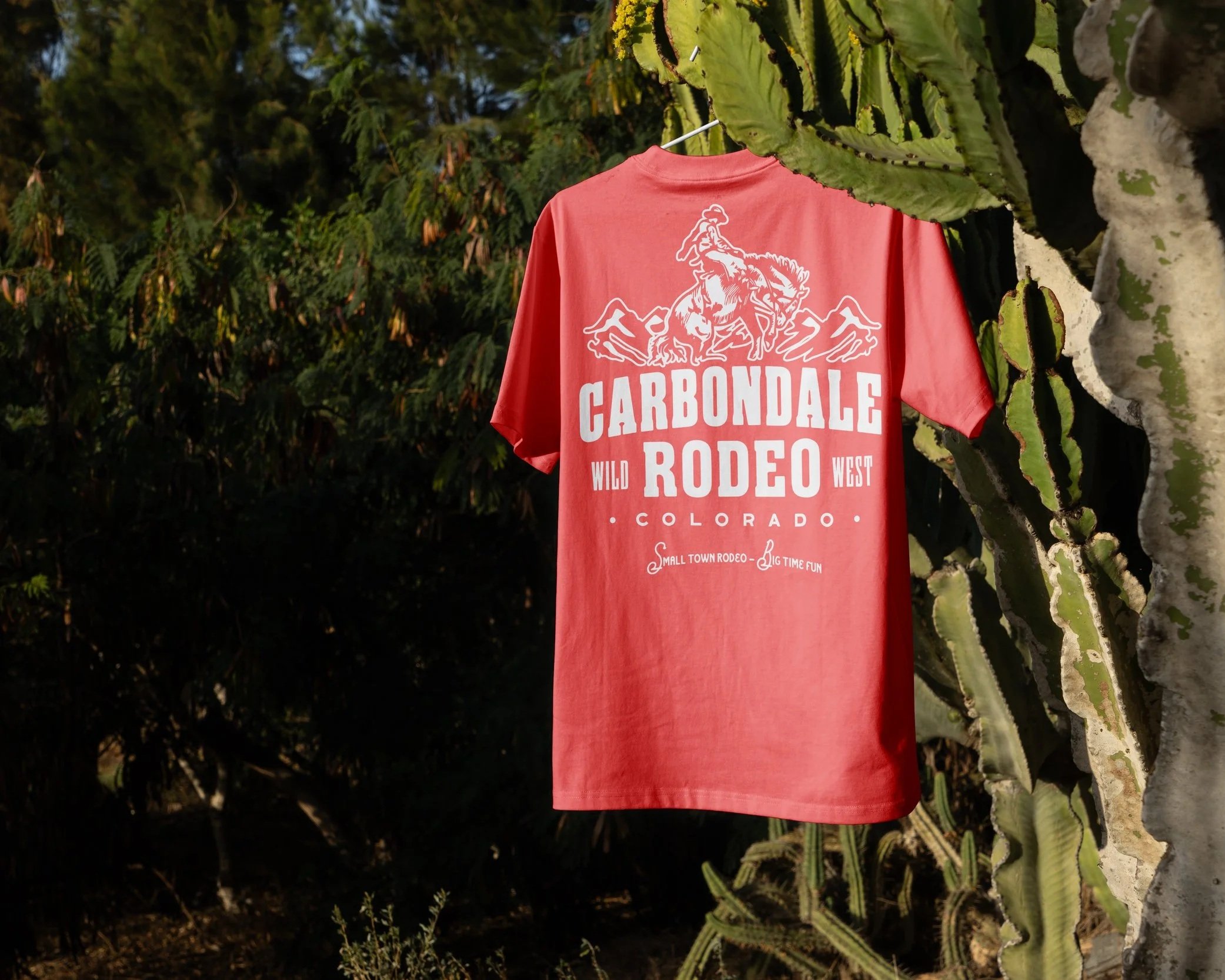
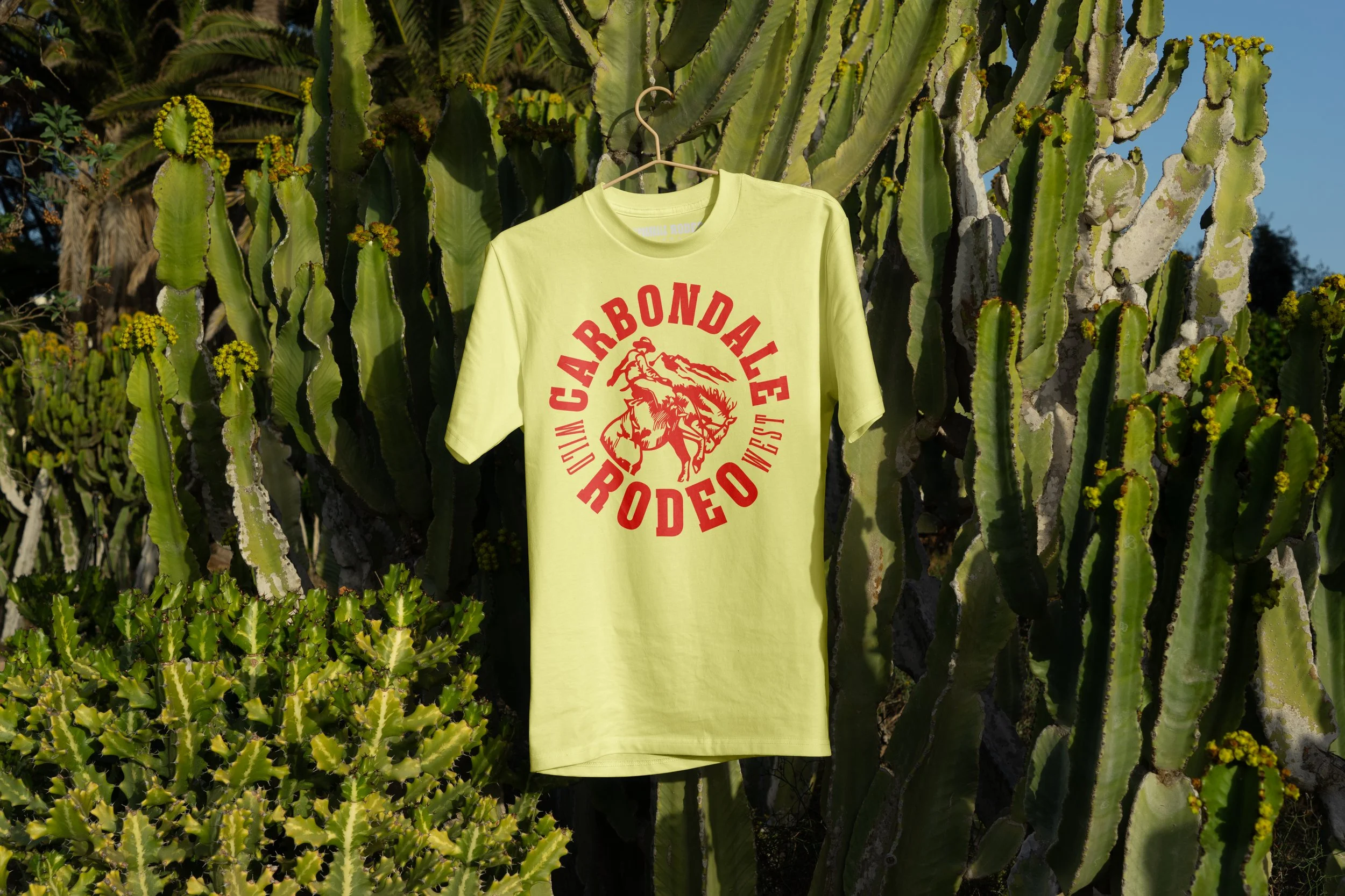
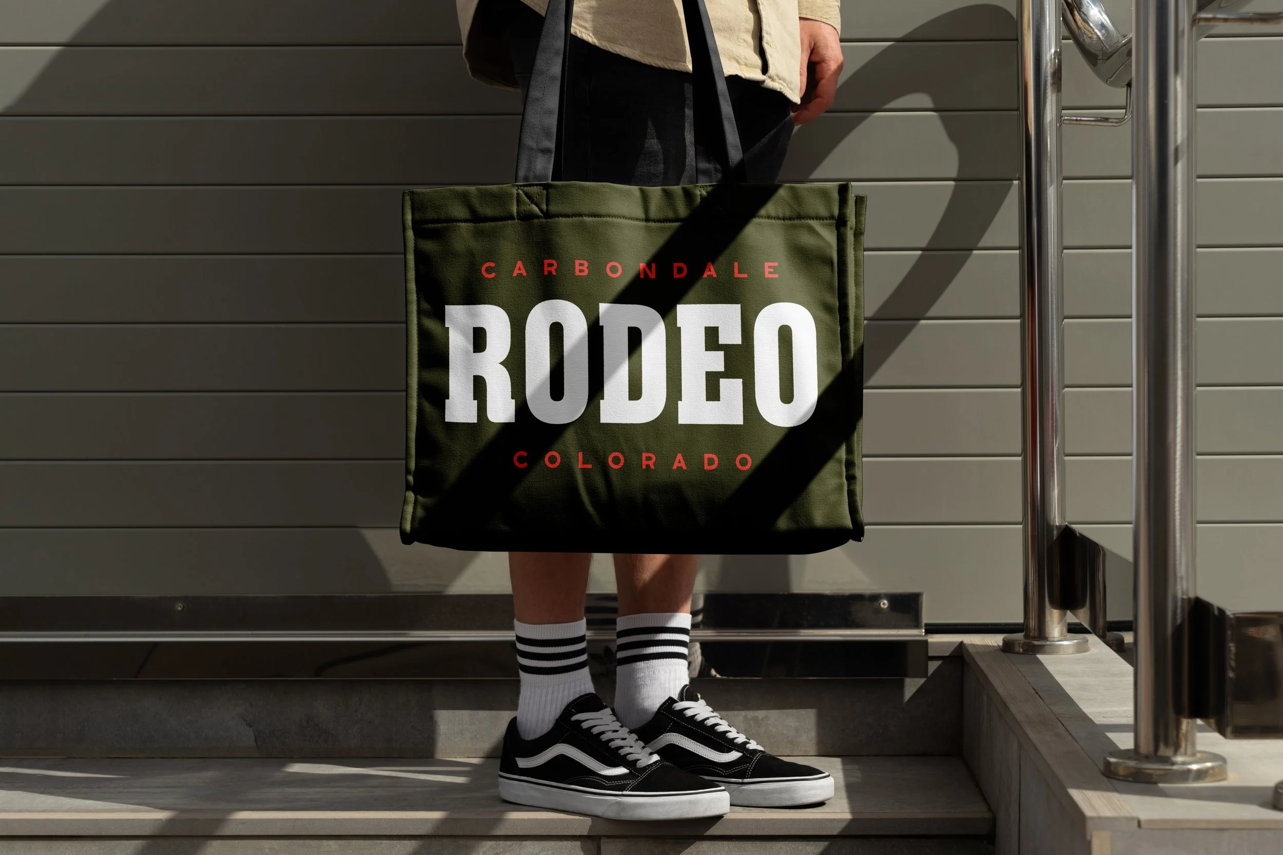
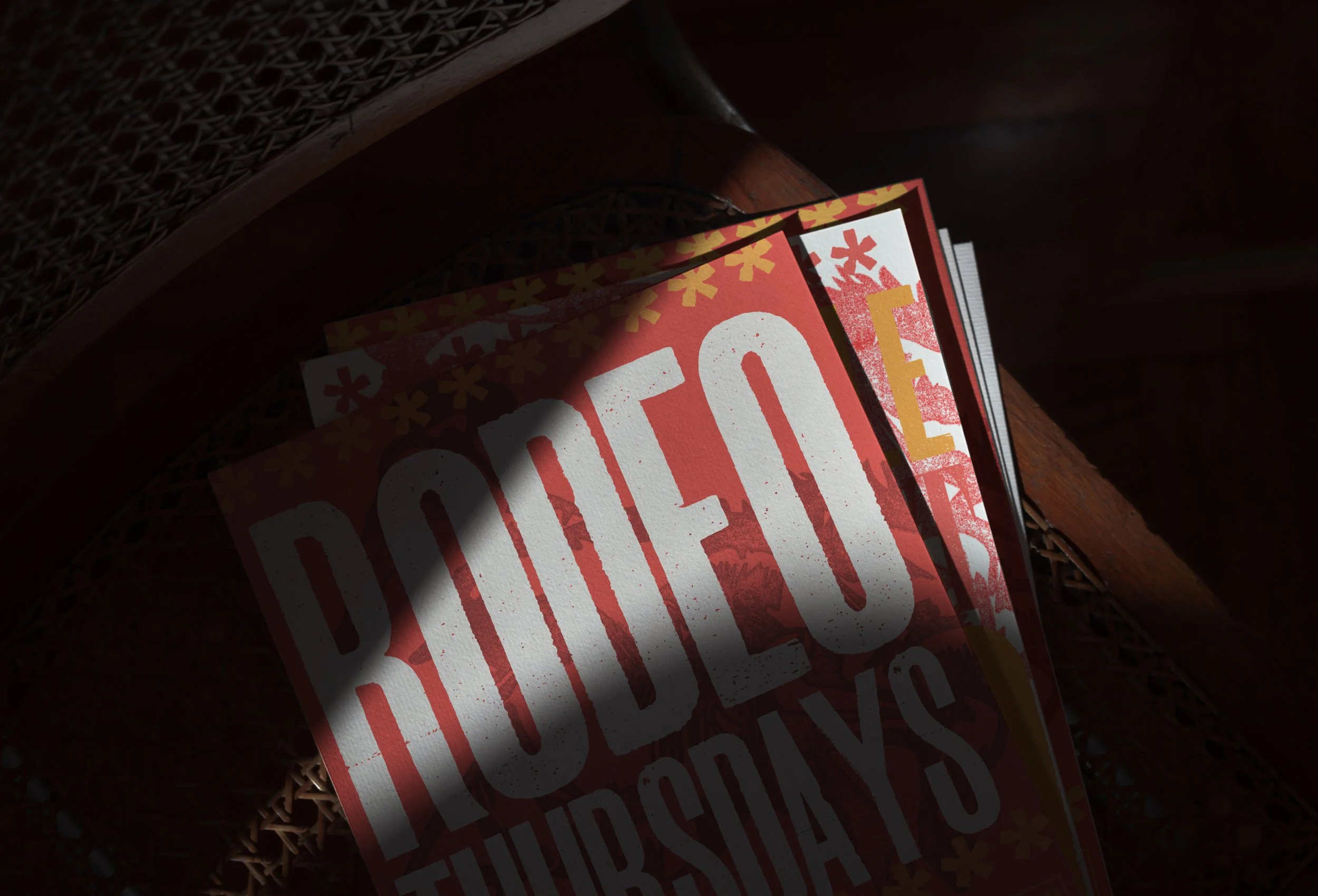
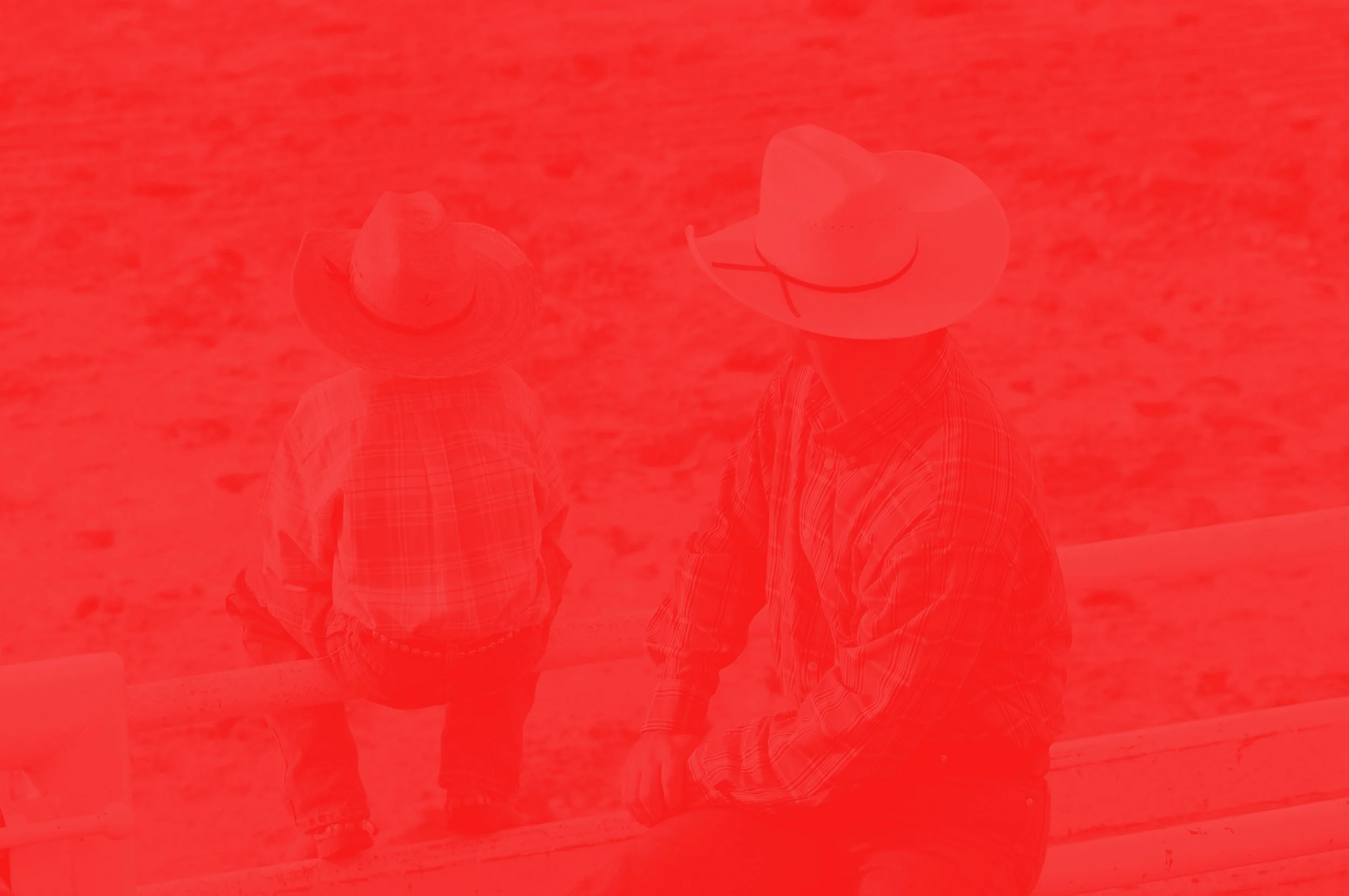
For the Carbondale Rodeo, HMDC developed a bold visual identity and apparel system designed to honor the grit, tradition, and community spirit that define small-town rodeo culture. The project centered on creating a brand that felt authentic to the working West rather than overly polished or commercialized, drawing inspiration from vintage western ephemera, hand-painted signage, worn rodeo posters, and the raw energy of the arena itself. The resulting identity balances timeless western character with a clean, adaptable system capable of living across merchandise, promotional materials, signage, and event branding.
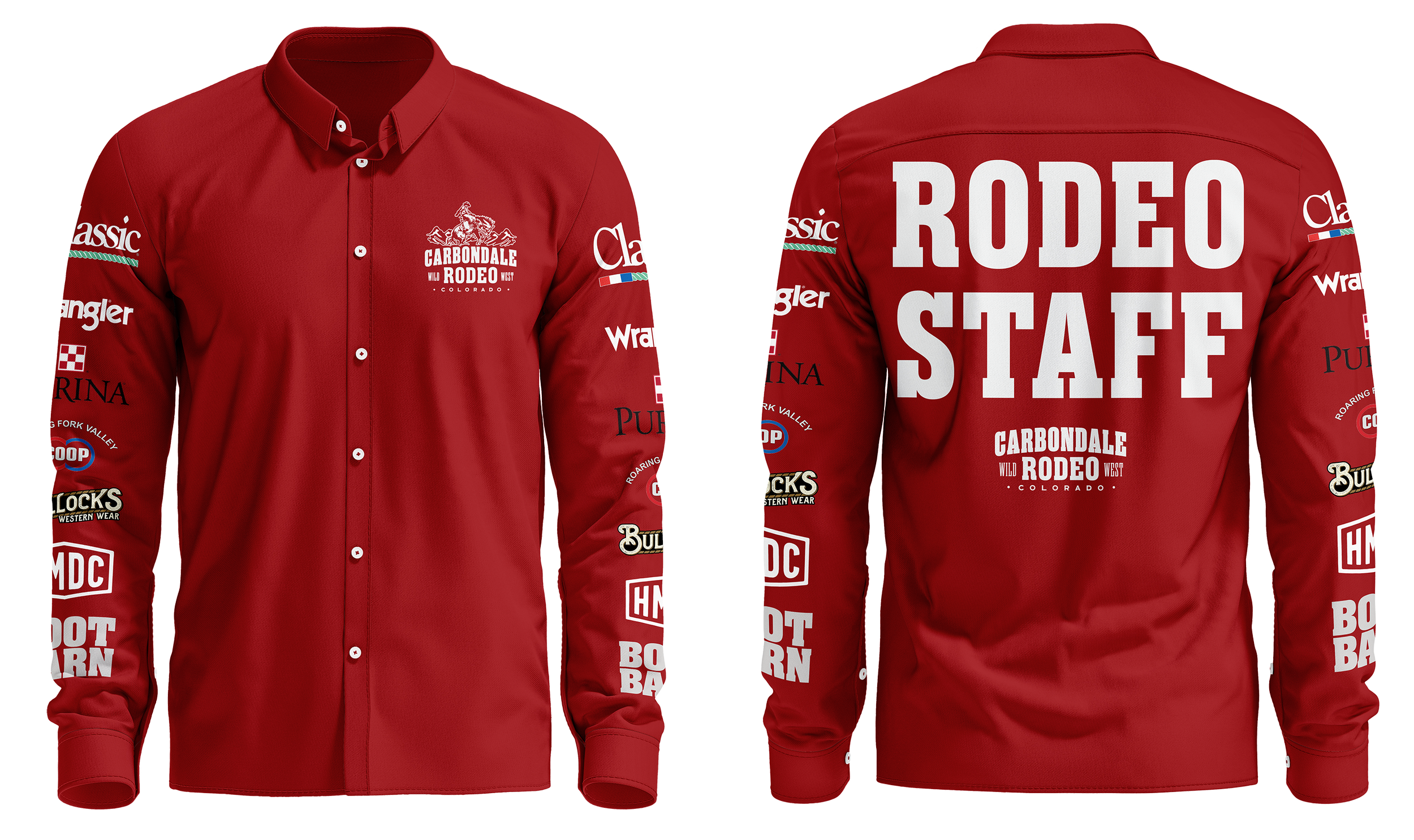
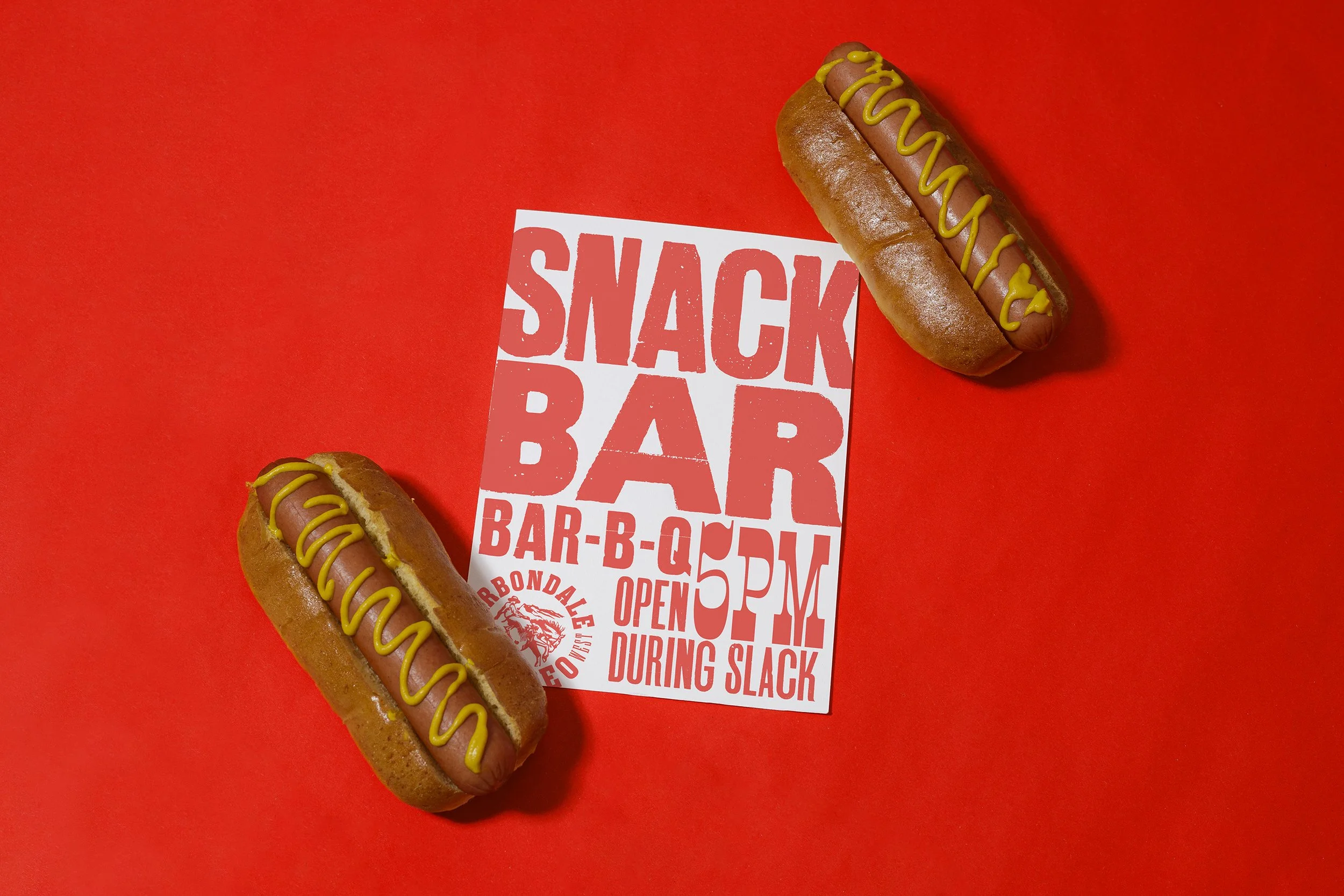
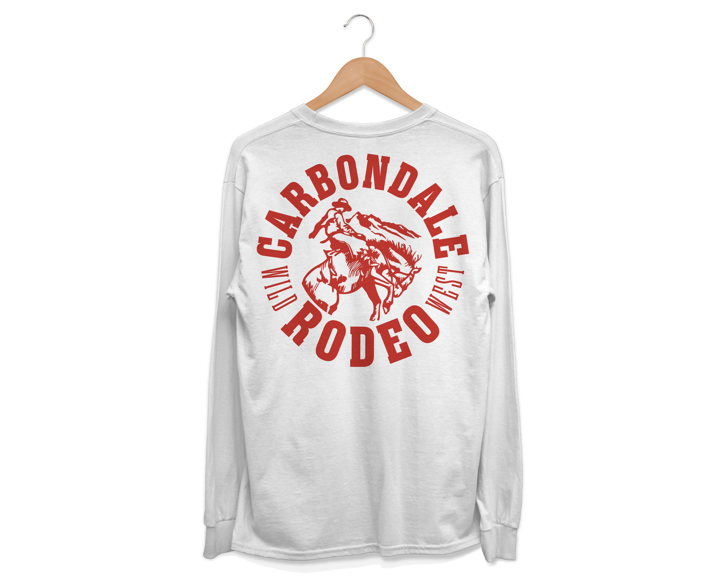
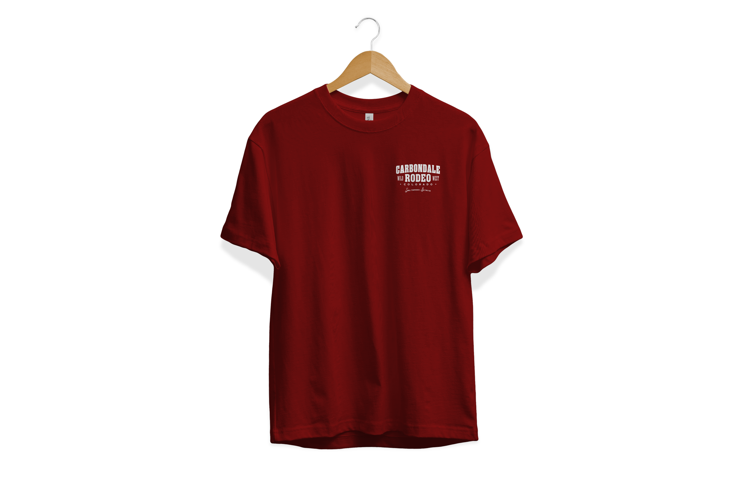
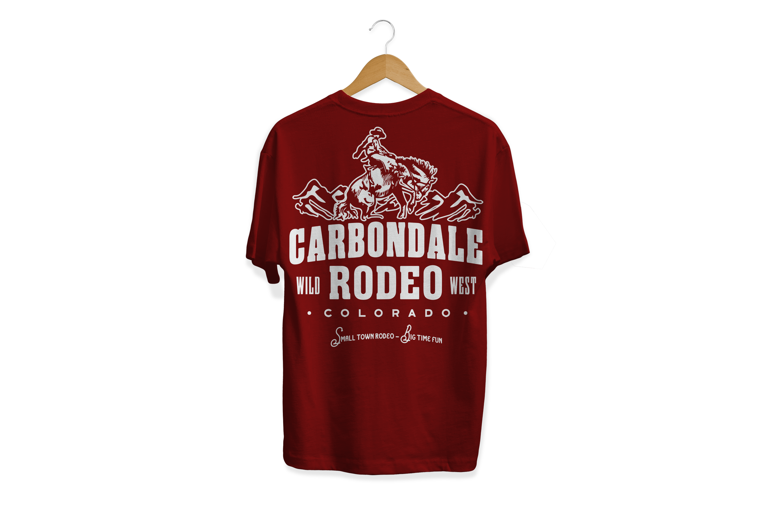
Alongside the primary logo and supporting visual identity system, HMDC created a full apparel line aimed at capturing the lifestyle surrounding the rodeo just as much as the event itself. The graphics were intentionally designed to feel collectible, lived-in, and rooted in genuine western culture, avoiding trend-driven aesthetics in favor of something more enduring and recognizable. From bold typography and illustrative elements to simplified iconography and merchandise applications, every piece was built to strengthen the rodeo’s identity while giving both locals and visitors something they genuinely wanted to wear long after the dust settled.
Fig. 1 Hero Logo Mark Lockup
Fig. 2 Stacked Type Lockup
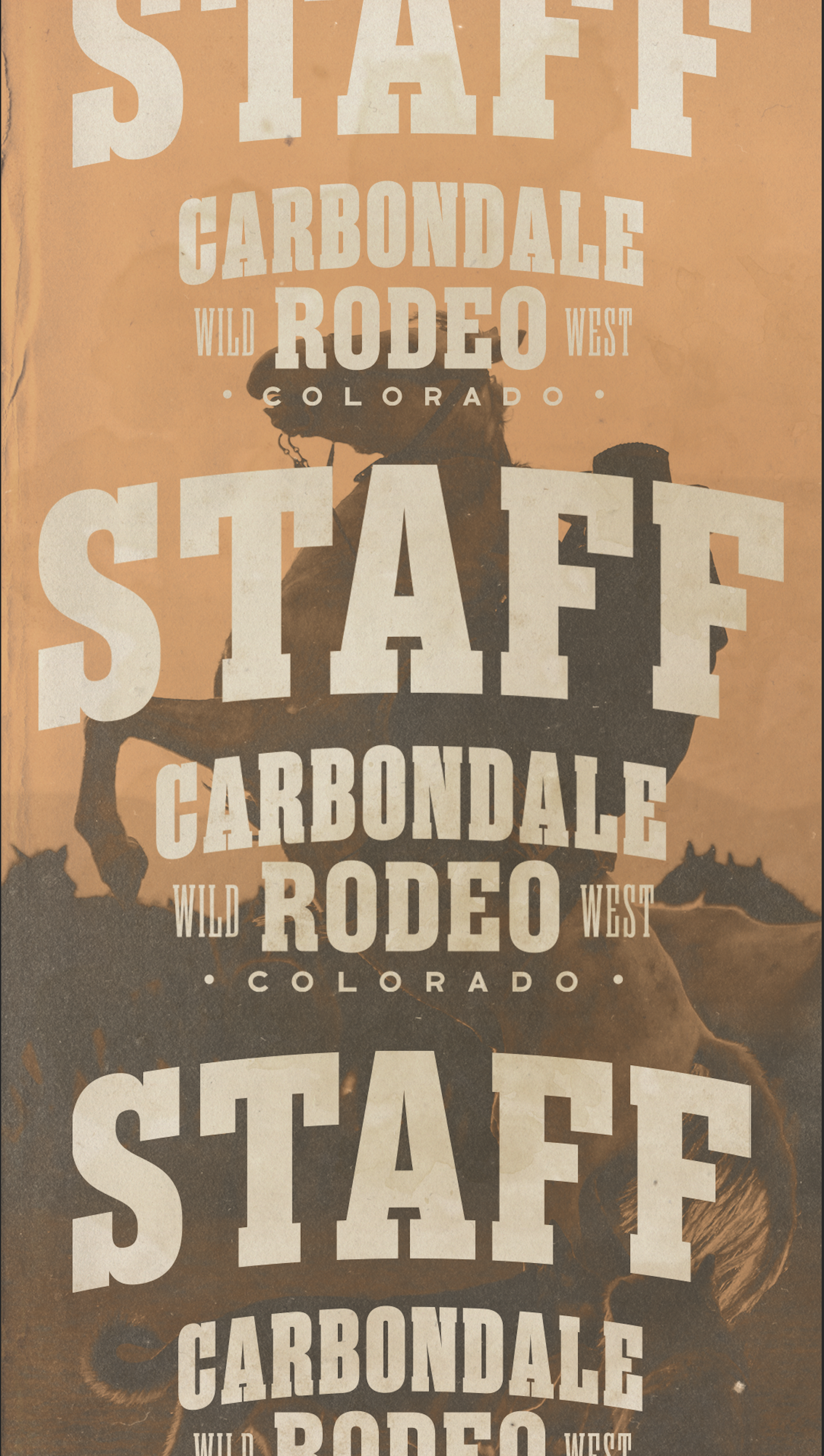
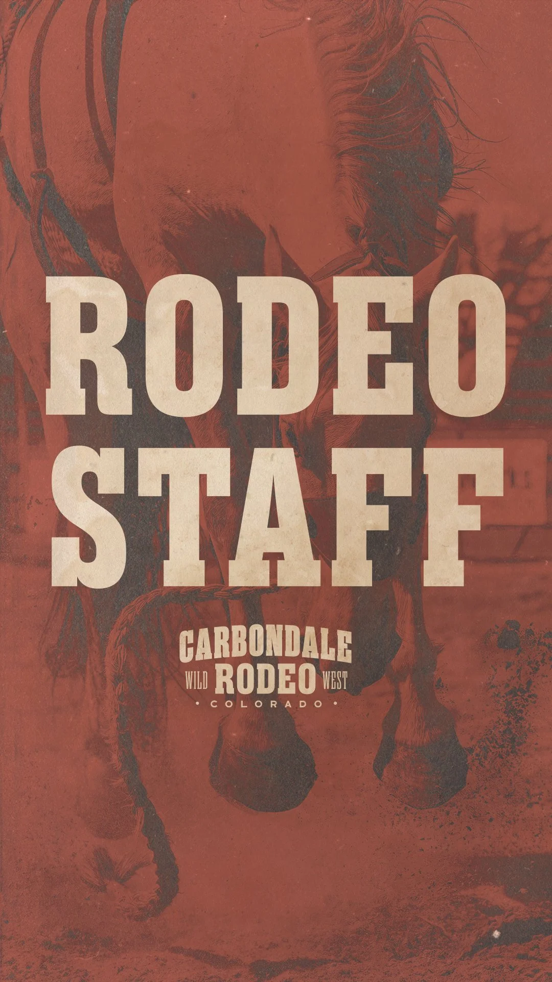
Fig. 3 Stacked Rodeo Staff Type Lockup
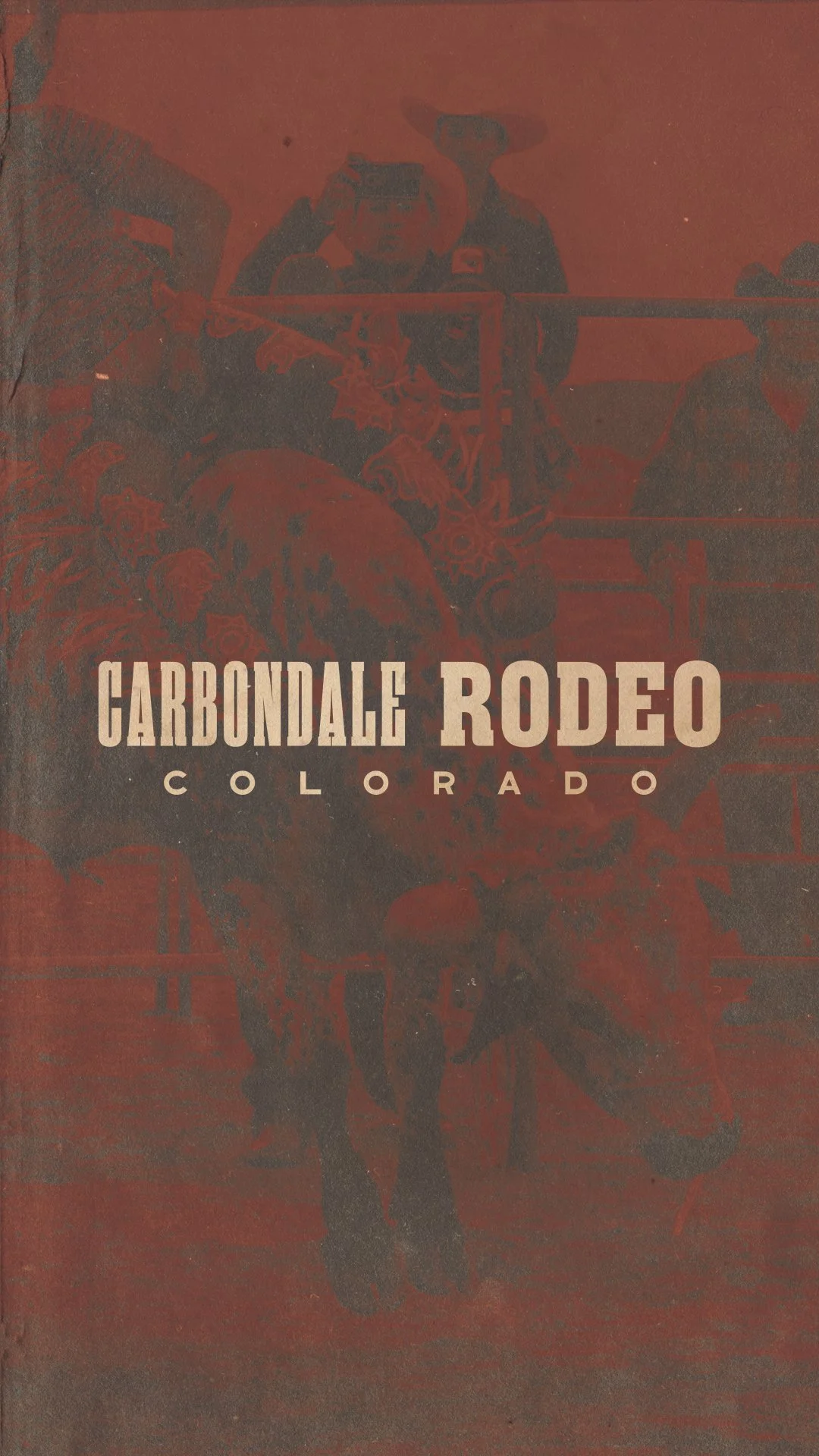
Fig. 5 Linear Logo Mark Type Combo
Fig. 4 Stacked Outline Type Lockup
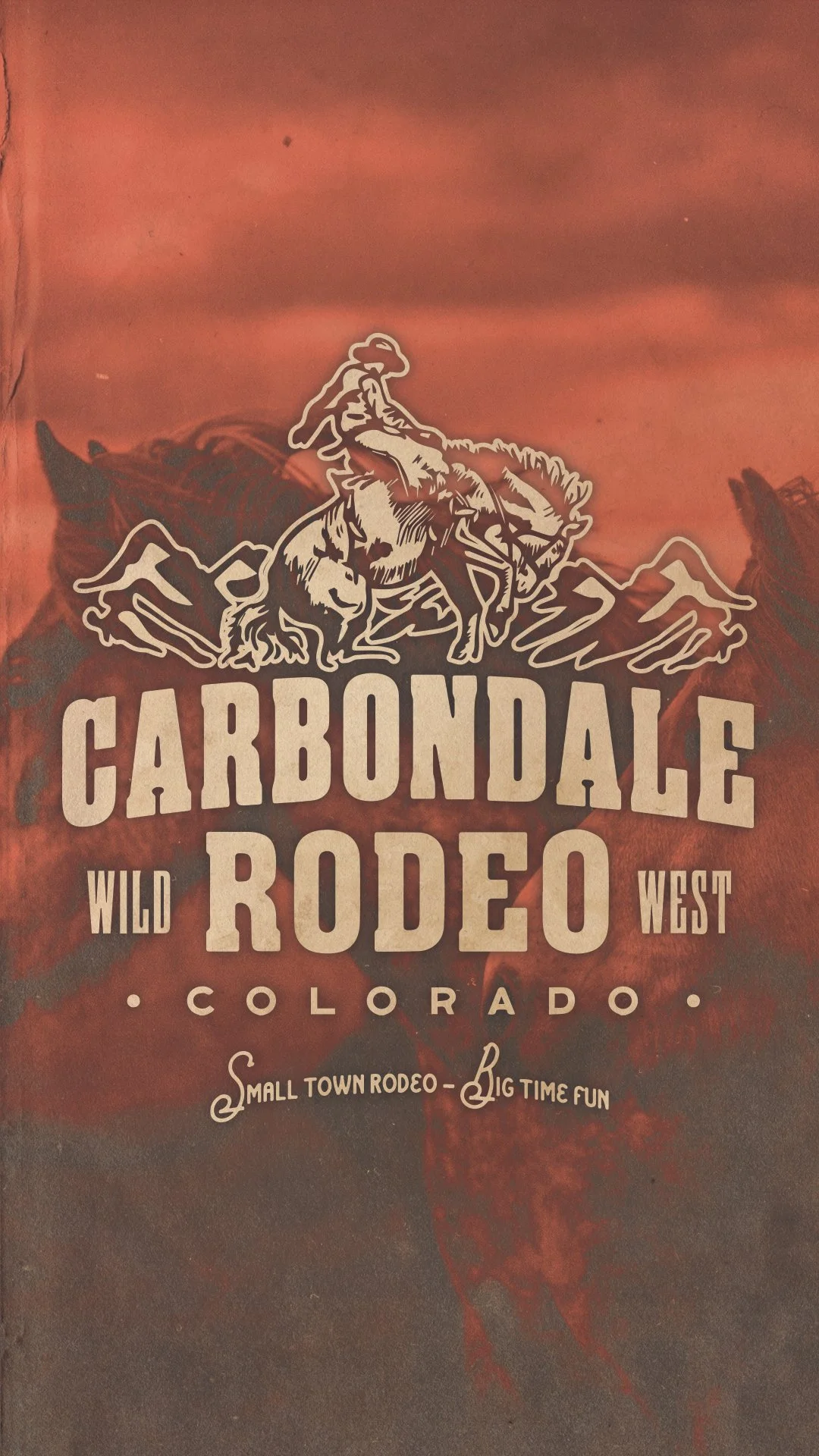
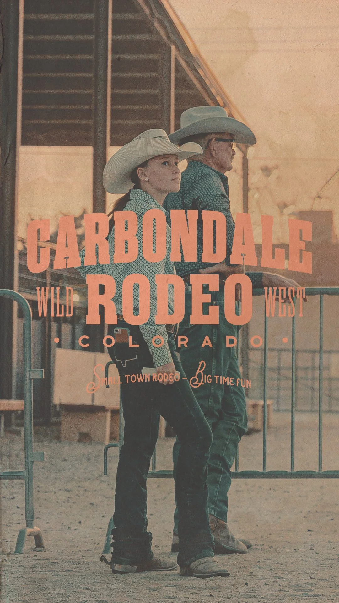
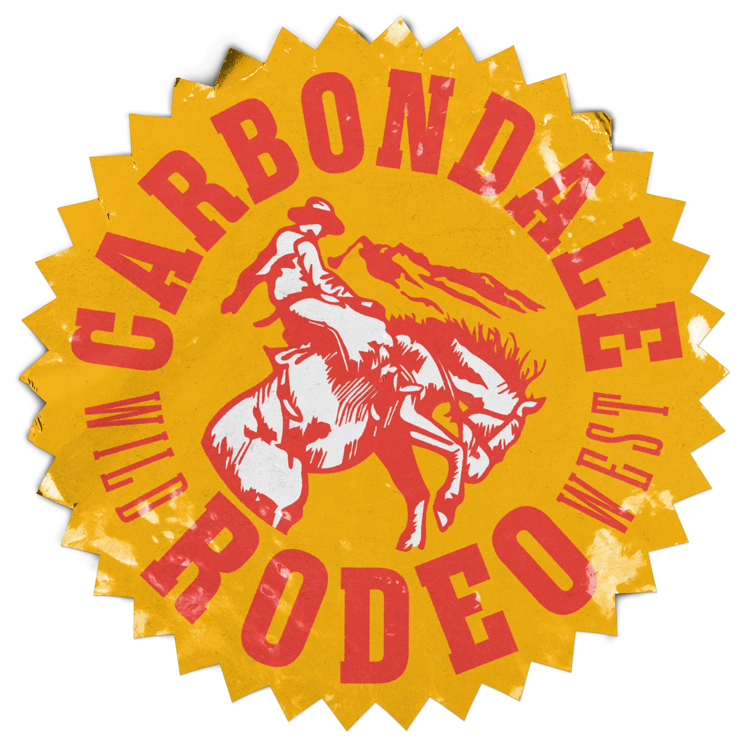
Fig. 6 Arched Stacked Type Lockup
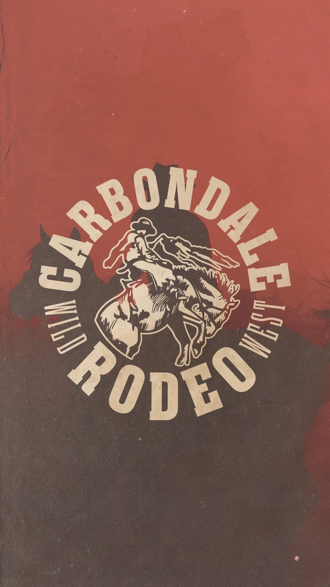
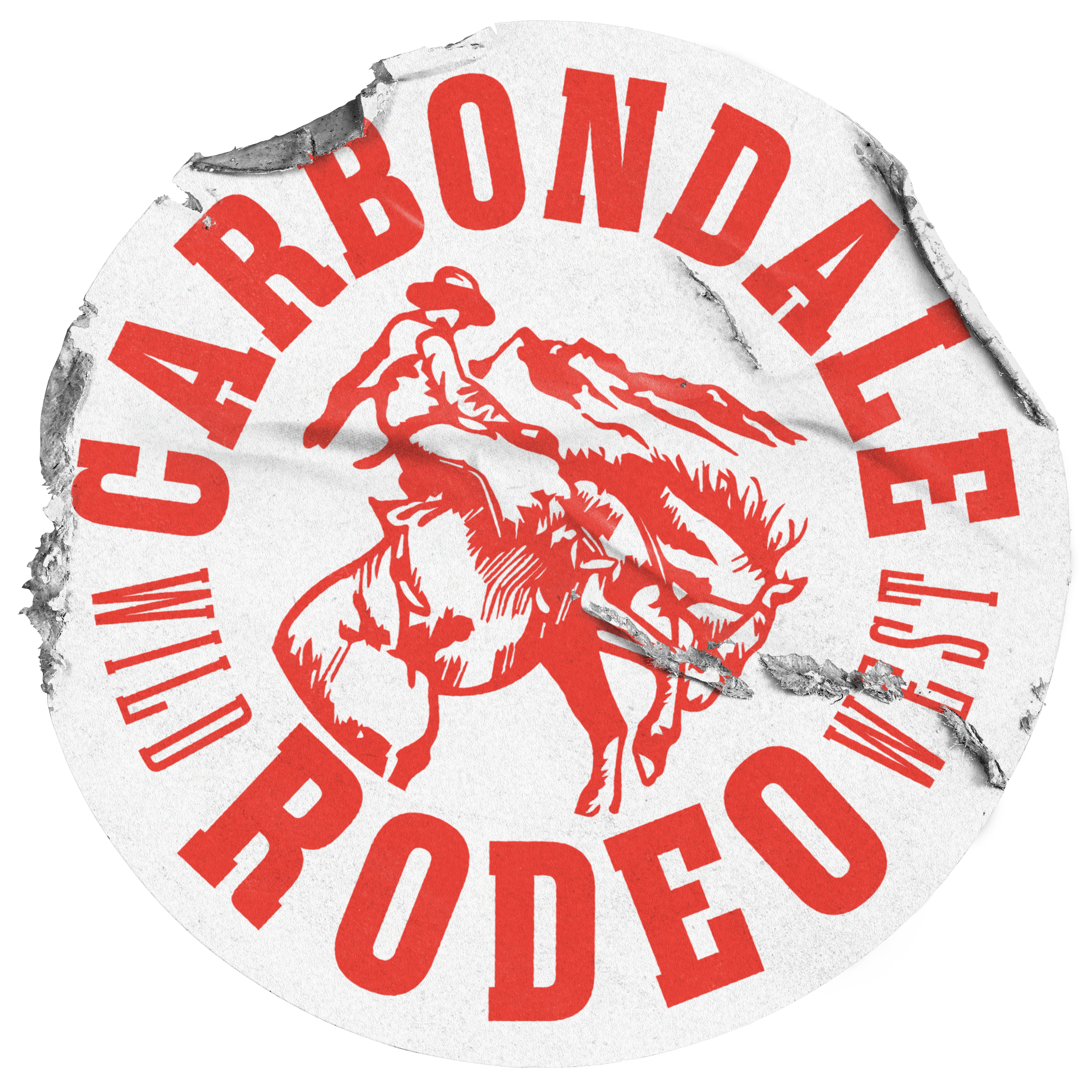
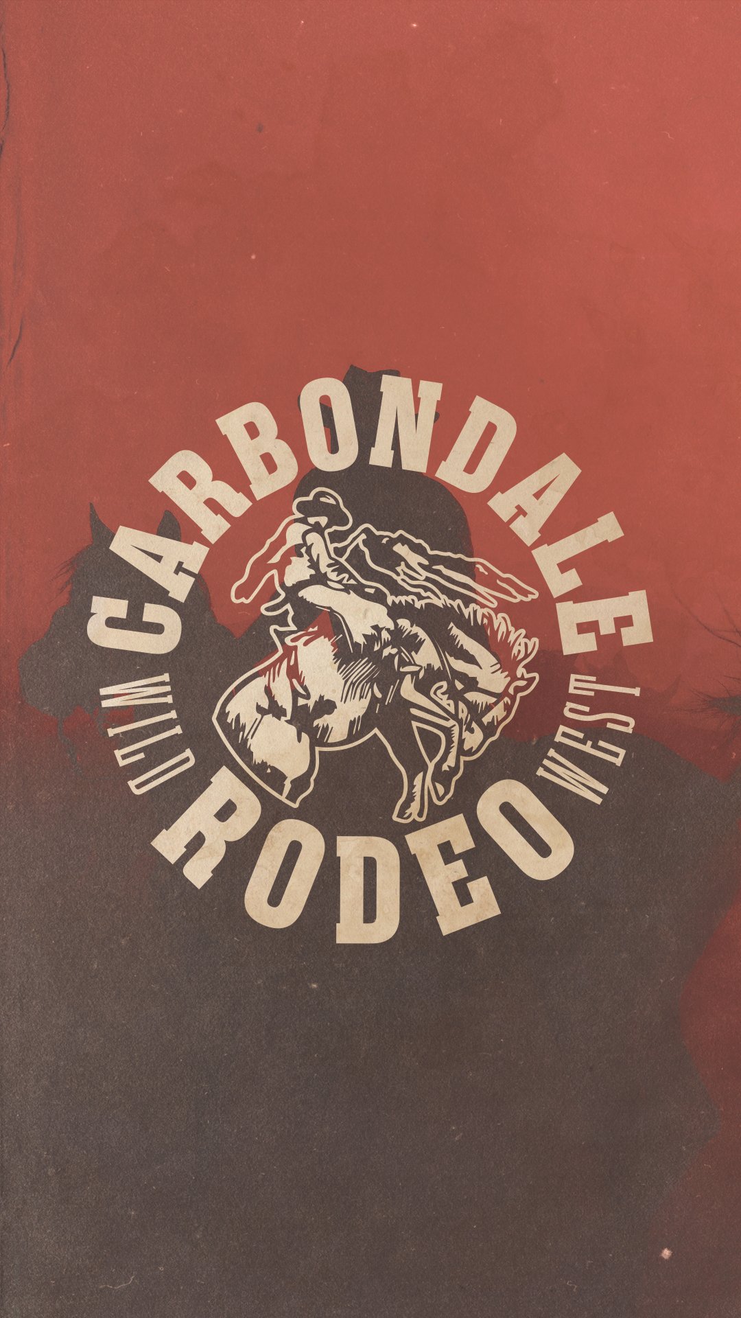
Fig. 7 Circular Seal Lockup
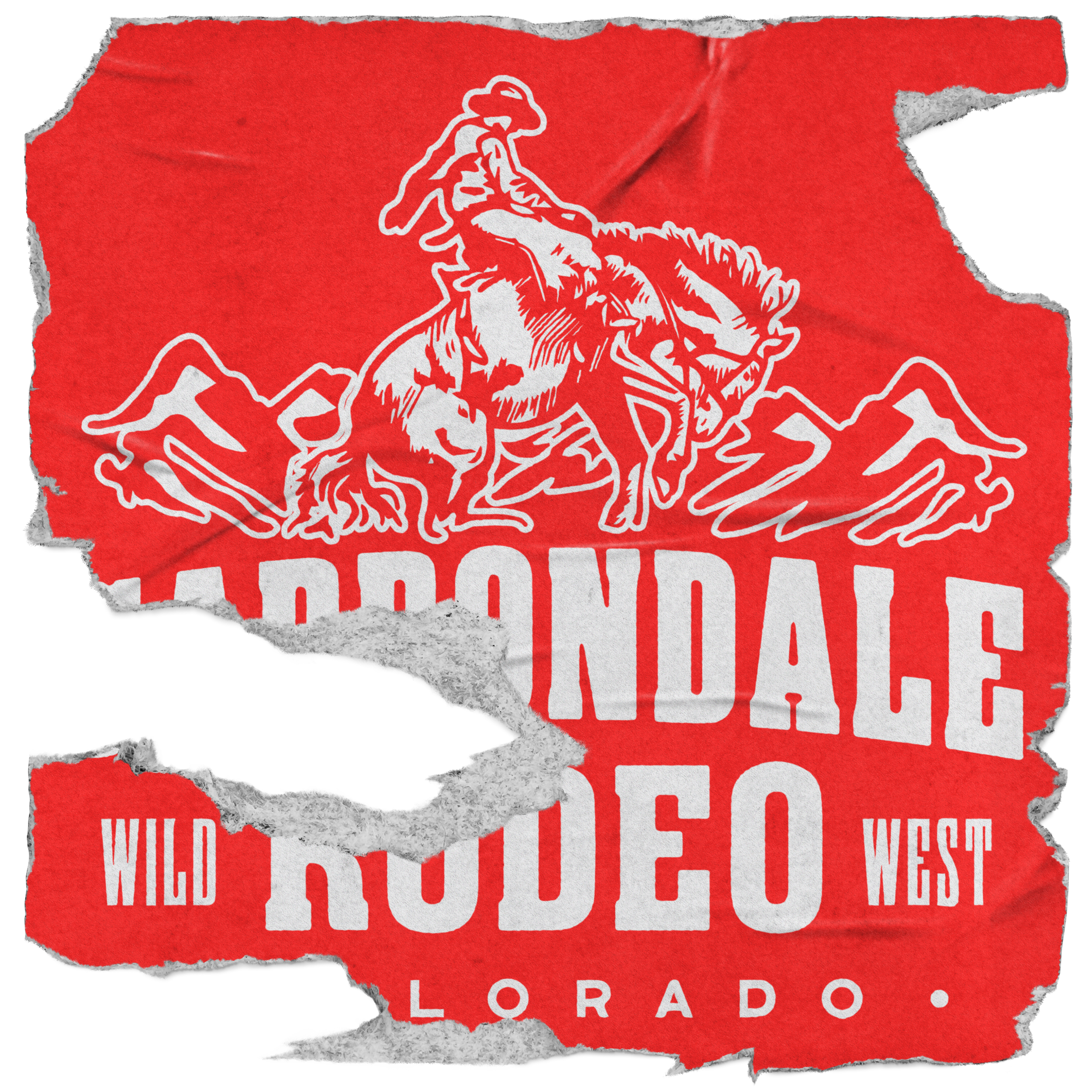
Fig. 8 Staff Stack Lockup
Fig. 9 Typography Line Lockup